Branding Week
After some reflection, this week ended with a theme—which is rare when you have your fingers in a bunch of pies across platforms and media. This week was my self-named “Brand Week.” We had a ton of projects come in, all from different departments, that needed a mark/look-and-feel/logo. I use these pretty loosely, since probably none of these fall cleanly into “logo” category. They’re not mean to stand alone, broken away from their supporting assets. But they do provide their respective initiatives with an identity meant to legitimize them.
Some weeks are reflected by the controlled chaos of your computer desktop. You get to the end of your to-do list and sigh because, finally, you can delete the one million screengrabs, random files, I’ll-just-leave-this-here-for-later’s…you get the idea. This past week was like that.
But regardless of the barely controlled mess that is my #quickburn, #hustle workflow, I put out A LOT of work for my team this week. So I’m just going to take a minute to give myself a pat on the back for that.
Together by Design
What do you do when you have a lot of cool ideas, know other people with even more cool ideas, and own a high-quality microphone? You start a podcast. And while it’s not “launched” yet…we’re noodling the idea of expanding our successful Together by Design thought leadership piece from last year.
Working primarily with Sales leadership and others on the marketing team, I created a series of podcast album art/brand identities to express the next phase of Together by Design (TBD).
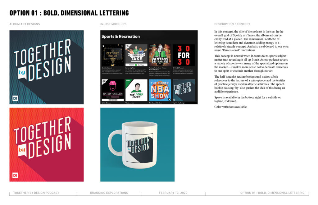
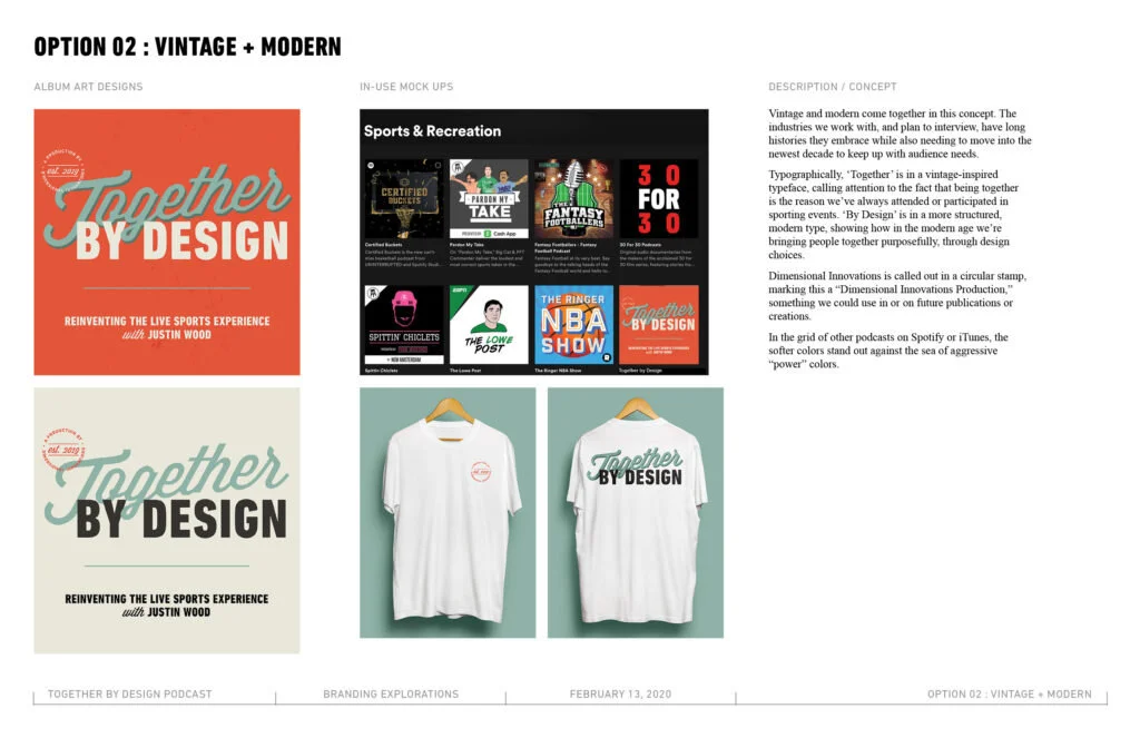
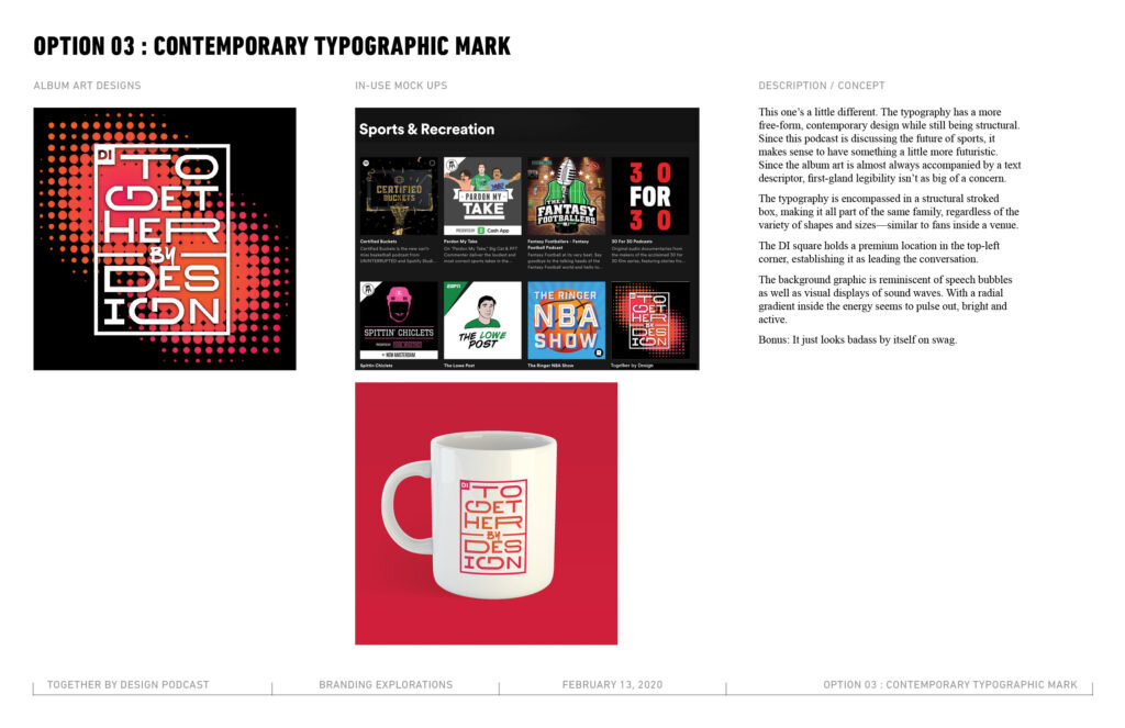
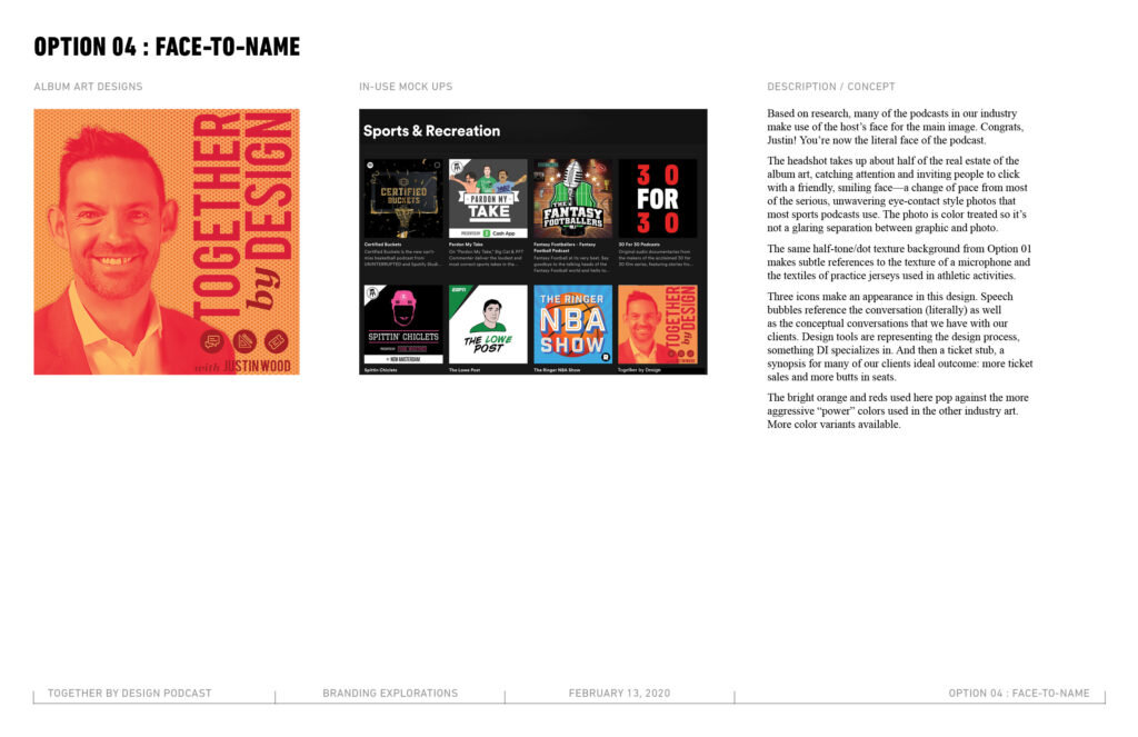
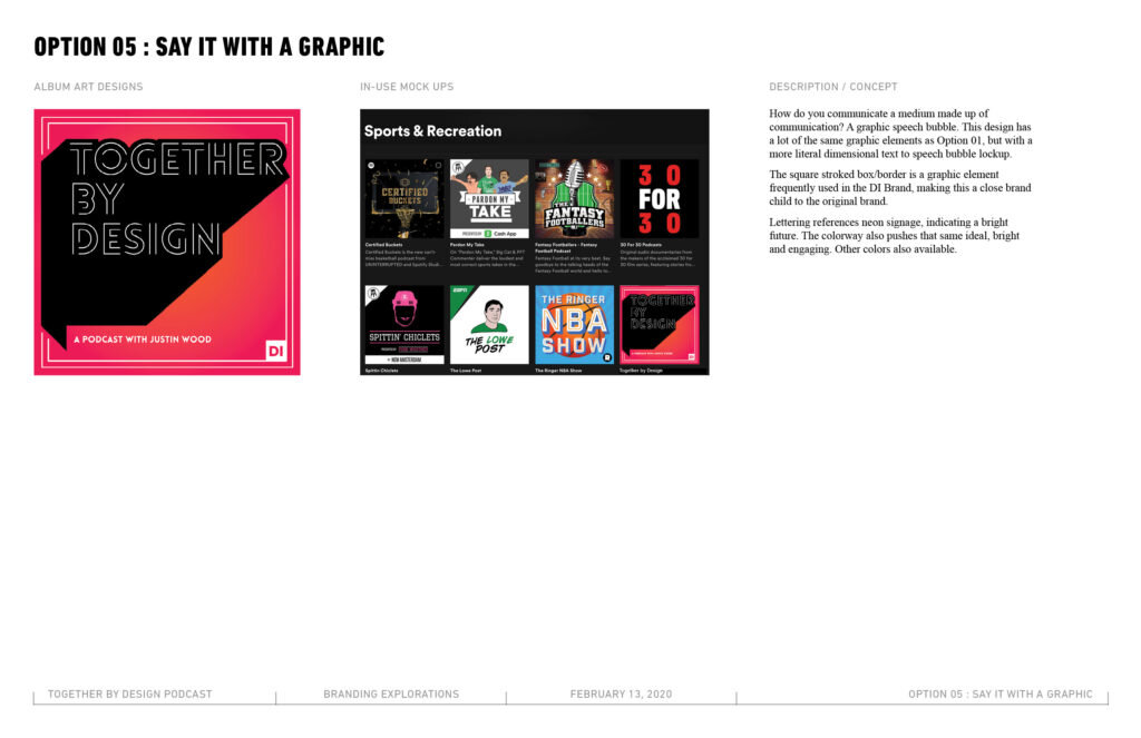
While I’m an avid podcast-listener for very specific publications (s/o to Lead Singer Syndrome and Lore), I can’t say that I’m an expert on podcast album art. This project started with a lot of scrolling through Spotify and iTunes trying to get a feel for the competition—let me tell you, there’s a lot of smart design out there…but there’s a lot of not great design out there as well.
The challenge we faced with TBD is how do we pose ourselves as a thought leader in sports (but not any particular sport, so no icons of footballs here) as well as looking like smart designers. The title has to be able to be read at a glance and at a very small scale. We want to stand out from the grid but not look like we don’t belong.
So my favorite wasn’t the winner but that’s just a classic designer struggle, ha!
Remarkable Golf Pro/Am
Our company is really lucky to have an incredible Foundation that truly cares about giving back to the KC-community. This year’s B-I-G fundraising event put on by our Foundation is a Pro/Am Golf Tournament…thing? You can tell I very obviously know things about golf (and did NOT live my life up until age 19 thinking that golf only had one hole that you had to try and hit from the other side of the course).
This project was a super quick turn-around. In two business days, my fellow designer and I at work came up with a pretty significant number of branding options for this event, PLUS! We created a sponsorship package for the PR event launching this event the same week.
I’m only showing you my branding options, because I definitely can’t take credit for Alex’s hard work, but just imagine these PLUS MORE all done in a crunch.
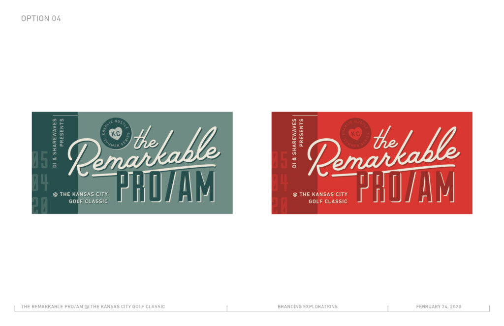
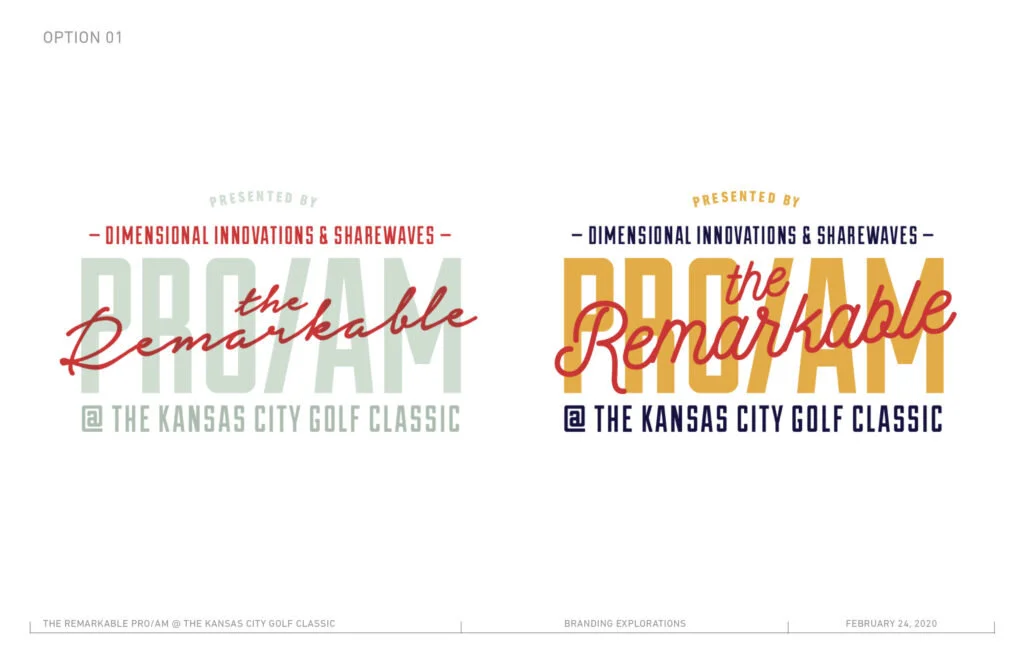
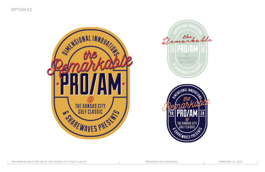
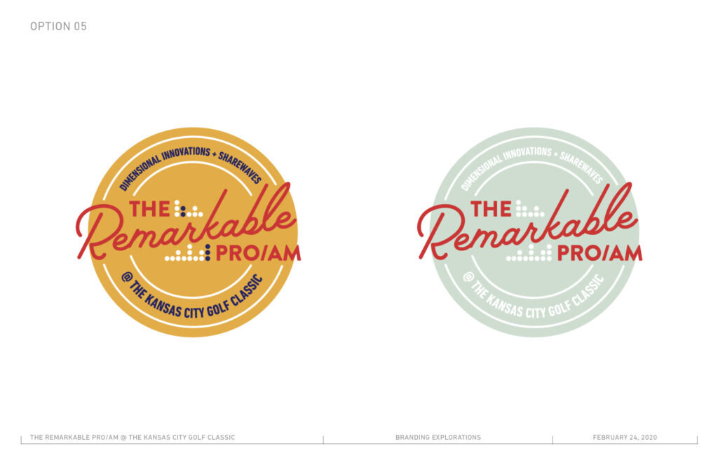
The overall branding of the series we’re a part of is themed very heavily into retro sports, so for our own event, we wanted to have a unique mark while still alluding to the original system. The real challenge here? A 15-word event title. That’s right. Fifteen.
Diversity Dialogue
The incredible Diversity & Inclusion team has started a new program called Diversity Dialogues that bring in outside resources and speakers to present on a topic and then help encourage productive, open conversations following. All graphics aside, this is just a cool-as-shit project to be around / a part of. Major props to our D&I team for pulling this together.
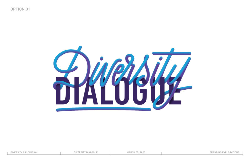
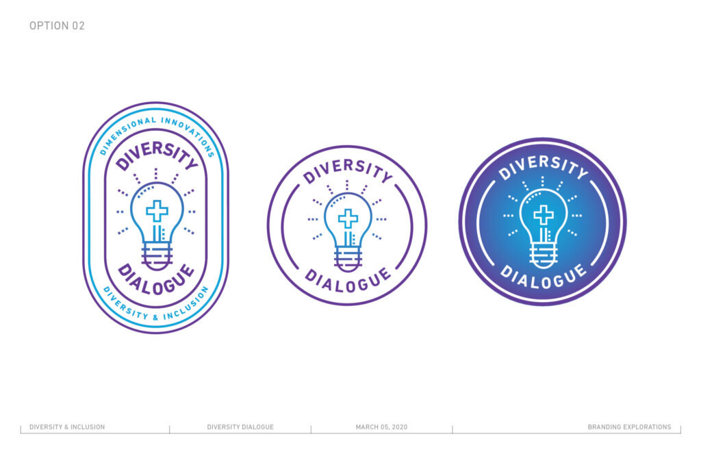
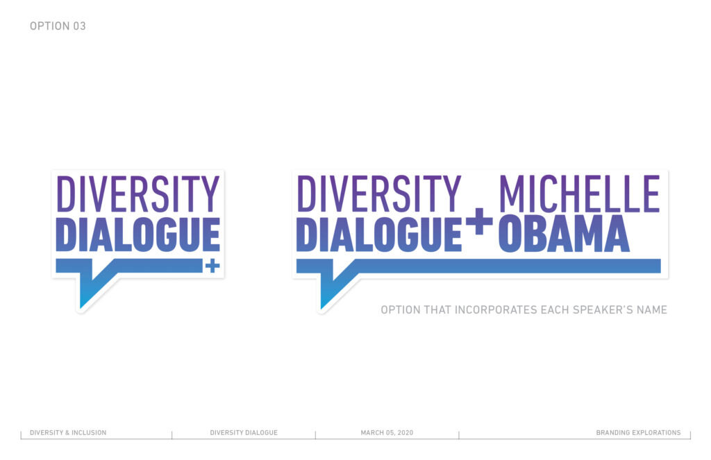
D&I already had a logo for their department developed that set the tone for these logos (it mainly featured a cyan-to-violet gradient that I used in each of these options). The plus-sign featured in two of the three options is also a key graphic element from their original logo.
Bonus! The script on ‘Option 01’? That’s my lettering (!) plus some cool new Illustrator effects that I learned just for this project.